Objective
Redesign and rebrand the existing website of a graphology platform offering handwriting and signature analysis, 1:1 consultations, and enterprise services — all while working within the legacy structure and tight visual constraints.
Scope: Visual redesign within legacy structure
To ground the case study, here’s a look at the final design outcome:
This high-level preview gives a sense of the system's clarity, structure, and responsiveness before we break it down.
This platform sits at the intersection of behavioral psychology and personal development, using handwriting and signature analysis as tools to offer deep insights into an individual’s traits. The goal was to present these offerings in a modern, trustworthy, and accessible manner — especially to attract new users and convert visitors through clear storytelling and UI.
Rebranded website visuals using existing structure
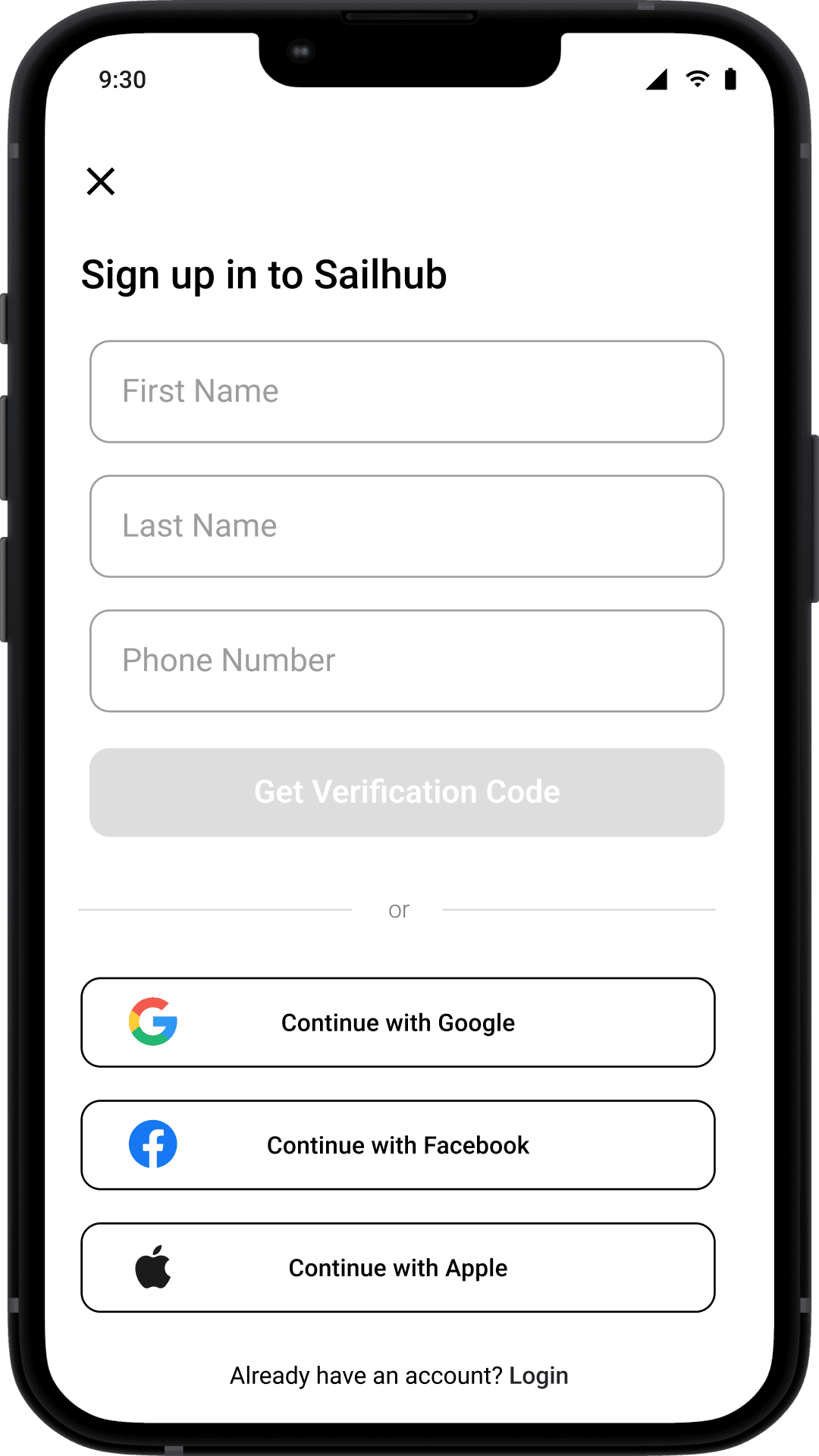
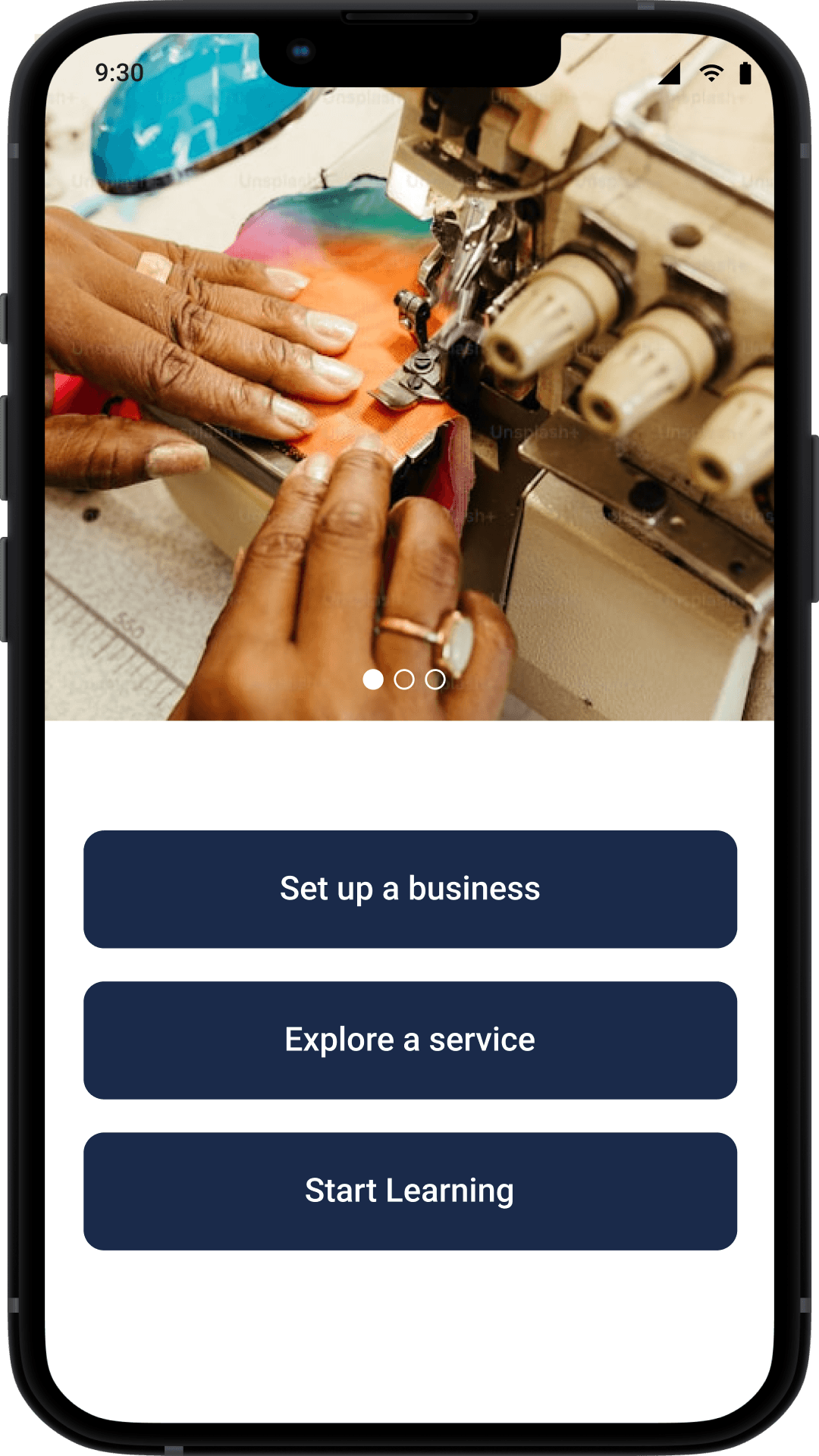
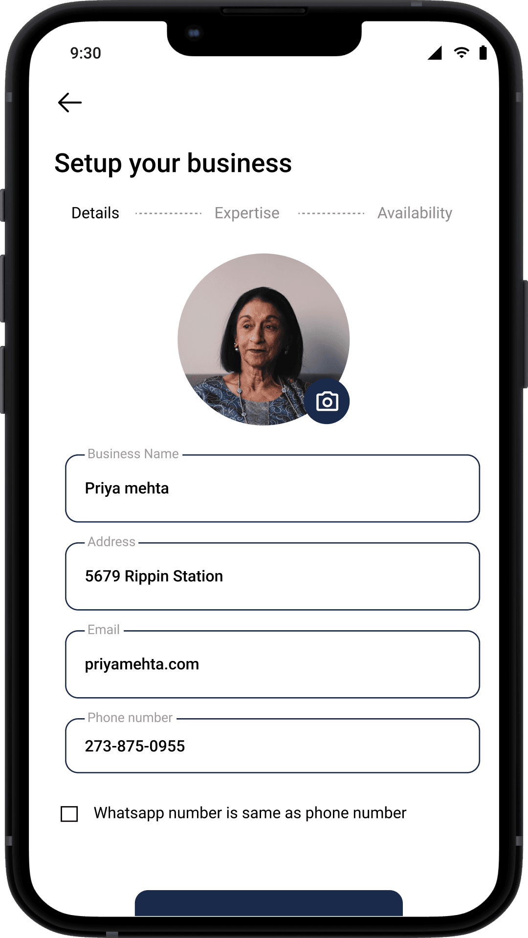
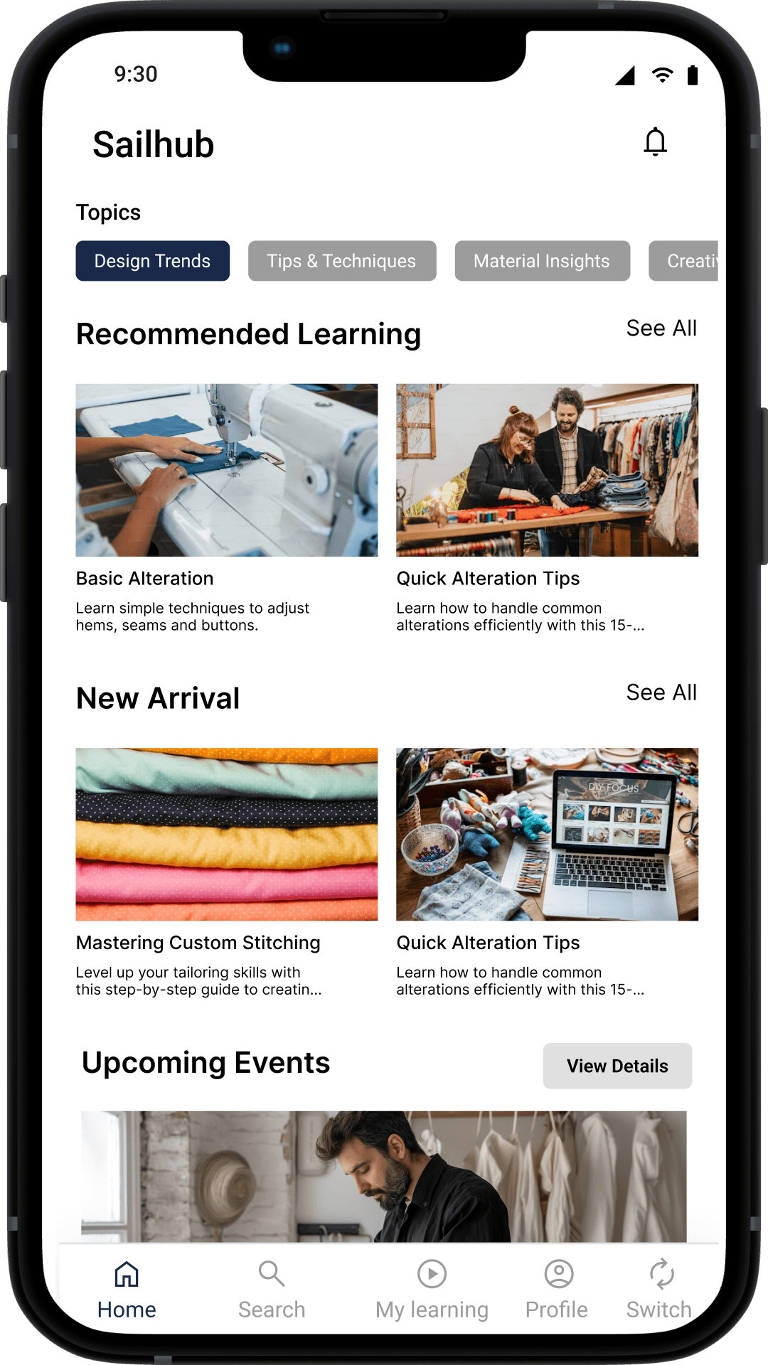
Introduced new pages: About Us, Blog, Enterprise Login
Made it mobile responsive
Delivered clean, intuitive UI while staying brand-aligned
Prioritized quick launch — deferred SEO improvements for future


I began by analyzing the existing design’s limitations. Along with a quick industry scan for layout inspiration, I documented what needed to stay untouched and where improvements could be introduced subtly — without breaking stakeholder constraints.

Before jumping into wireframes, I created a user flow diagram to map the key actions a user would take across the site — from exploring handwriting services to booking a consultation. This helped:
Identify navigation friction early
Align the team on how each page connects
Plan for logical entry and exit points, including for enterprise users
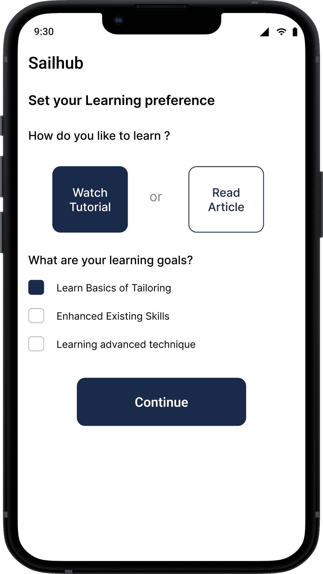
Usability Testing
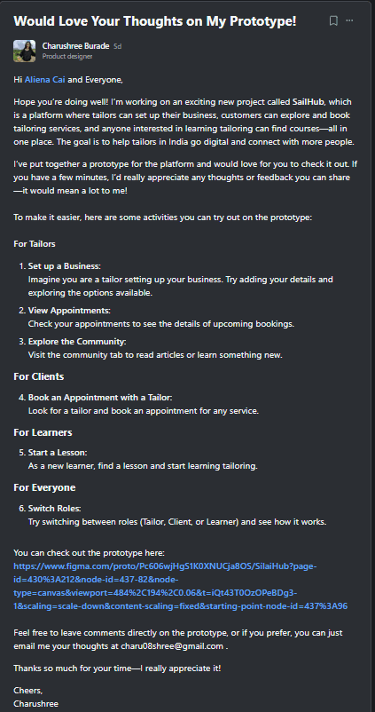
User Testing Report
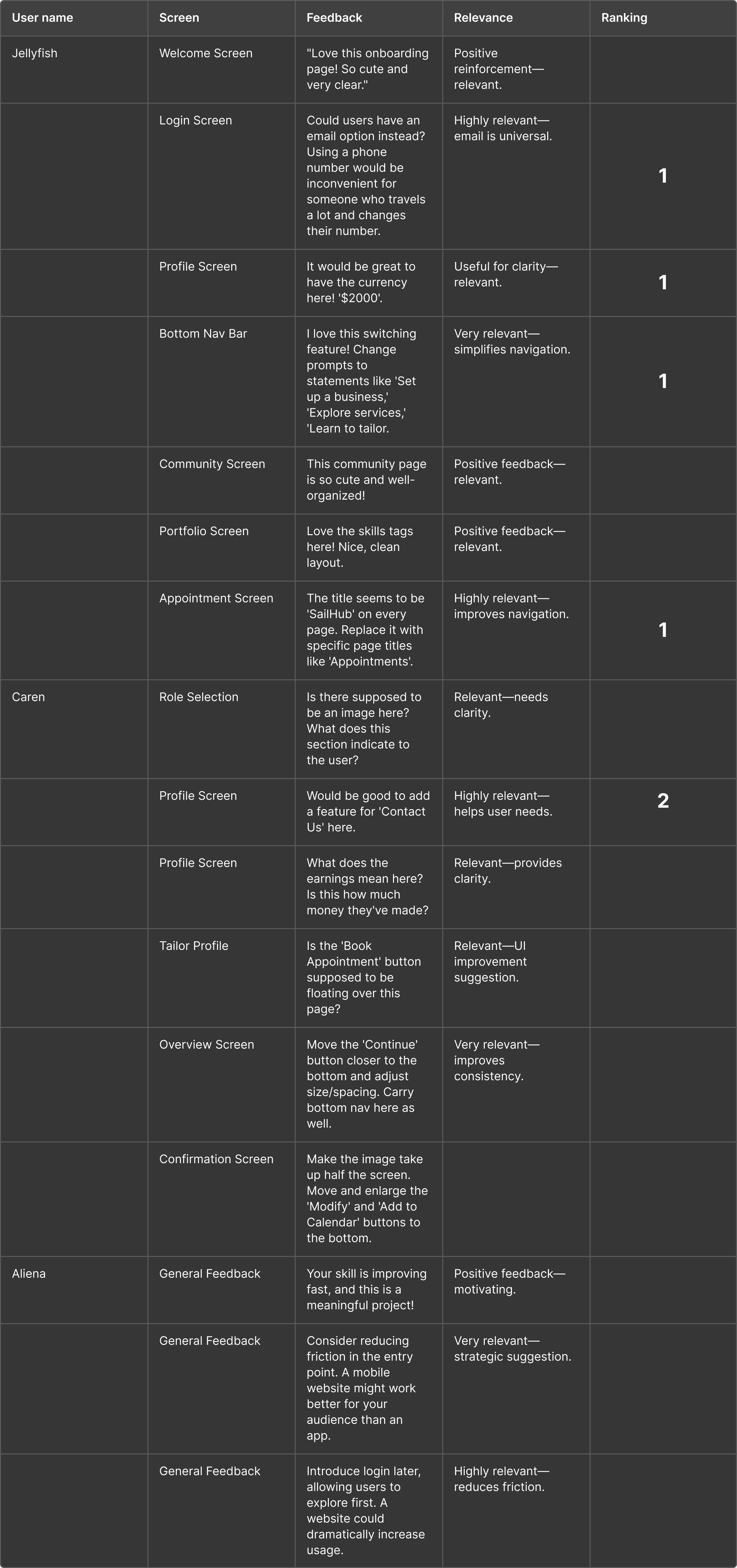
Wireframing helped get early buy-in from stakeholders and move quickly to hi-fi versions with minimal rework.
To set the foundation, I created digital wireframes directly in Figma. These helped me:
Define spacing, hierarchy, and flow
Add newly requested sections without disrupting layout consistency
Design for responsiveness (desktop and mobile from the start)
Usability Testing
User Testing Report
Wireframing helped get early buy-in from stakeholders and move quickly to hi-fi versions with minimal rework.
Given the fast-moving startup environment, I adopted a feedback-first, low-risk iteration cycle:
All within a compact, readable, responsive interface.

While assessing the layout, I flagged SEO issues — such as lack of semantic structure and heading hierarchy. However, the team prioritized going live over fixing SEO at this stage, which we planned to revisit post-launch. I documented this clearly for handover.
Delivered a modern, consistent UI without disrupting existing structure
Created scalable layouts for upcoming content additions (blog, enterprise)
Enabled faster dev handoff with clean, annotated Figma files
Contributed to internal design standards for future updates
Designing under legacy constraints taught me how to balance creativity with practicality
Iterating in short cycles helped me build a habit of continuous alignment with stakeholders
Collaborating closely with developers from day one made the handoff smoother and more accurate
It reinforced the value of raising concerns early (like SEO or accessibility) even if they aren’t implemented immediately
Propose and implement SEO-friendly improvements now that the MVP is live
Suggest a design system or component library to support future consistency
Conduct a lightweight usability test to identify post-launch UX gaps
Create marketing-focused landing pages to improve conversion rates for enterprise clients